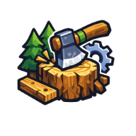
Chop Chop Inc Logo: Branding, Community Art, and the Story Behind the Game's Identity
Explore the Chop Chop Inc logo, its design, community artwork, and how the game's branding shapes player identity in this furniture empire sim.
The Rise of Chop Chop Inc: More Than Just a Logo
When you get fired from Furnox Corp and decide to build your own furniture empire, you need more than just a good work ethic—you need an identity. The Chop Chop Inc logo has become a symbol of rebellion, humor, and the quirky charm that defines this indie gem. But what makes this branding so memorable? Why has the community latched onto it so quickly?
Chop Chop Inc. hit Steam with a bang, priced at $12.99 and promising a handcrafted world full of weirdos, secrets, and trees that are practically begging for violence. The game's premise is simple: chop wood, process resources, automate production lines, and sell clever furniture sets for bonus cash. Yet, the visual identity—anchored by that unmistakable Chop Chop Inc logo—has sparked conversations, fan art, and even a few memes across the Steam community.
For players who've spent hours in the game, the logo represents more than just a title screen. It's a badge of honor for those who've embraced the crude humor, the automation loops, and the satisfying "chop > craft > sell > repeat" cycle. Let's dive deep into why the branding matters, what the community thinks, and how you can spot authentic Chop Chop Inc. merchandise and artwork.
Deconstructing the Chop Chop Inc Logo Design
The Chop Chop Inc logo immediately communicates the game's tone: playful, industrial, and slightly unhinged. While the game itself features a golden coin-loving chest companion and a kawaii drone named Bober the Builder, the logo leans into the lumberjack fantasy with bold typography and rugged aesthetics.
Visual Elements That Define the Brand
| Design Element | Description | Community Reaction |
|---|---|---|
| Typography | Bold, chunky letters with a hand-hewn feel | Players love the "rough around the edges" look |
| Color Palette | Earth tones with accent pops (likely green/brown) | Matches the forestry and crafting themes |
| Iconography | References to axes, wood, or factory elements | Reinforces the "furniture empire" concept |
| Overall Vibe | Industrial meets whimsical | Perfectly captures the game's humor |
Community reports indicate that fans have started creating their own interpretations of the Chop Chop Inc logo in the Steam Artwork section. One player, PapaJay, shared artwork titled "its just different over here on this cliff..." which showcases how the logo inspires creative expression beyond the game itself.
The logo's design philosophy aligns perfectly with the game's core loop. It's not trying to be sophisticated or minimalist—it's saying, "We're here to chop wood, make furniture, and have a laugh doing it." That authenticity resonates with players who are tired of overly polished, corporate game branding.
How the Community Embraces the Brand
The Steam community page for Chop Chop Inc. has become a hub of activity since the game's launch. With 3,855 in-game players and 9 in Group Chat at the time of data collection, the community is small but fiercely engaged.
Community-Created Content and Fan Art
| Content Type | Example | Creator | Engagement |
|---|---|---|---|
| Artwork | Cliff-themed logo reinterpretation | PapaJay | 2 awards |
| Screenshots | In-game moments featuring branding | Crazy Nilo™ | 5+ awards |
| Guides | 100% Achievement Guide | Fid | Community staple |
| Videos | Let's Play series | SilenceLP | Growing viewership |
What's particularly interesting is how the Chop Chop Inc logo appears throughout community content. Players are incorporating it into their screenshots, using it as a backdrop for their guides, and even creating video thumbnails around it. This organic brand adoption is exactly what indie developers hope for—it means the visual identity has resonated enough that players want to associate themselves with it.
One player review from Shmoogy captured the spirit perfectly with a Monty Python reference: "I'm a lumberjack and I'm OK, I sleep all night and I work all day." This kind of playful engagement shows that the brand isn't just a logo—it's a personality that players want to embody.
Player Experiences: What the Community Says About the Game
Beyond the branding, the community has been vocal about their experiences with Chop Chop Inc. Understanding these perspectives helps contextualize why the Chop Chop Inc logo matters so much to the game's identity.
Steam Reviews Breakdown
| Review Type | Hours Played | Key Points | Verdict |
|---|---|---|---|
| Positive | 6.6 hours | Lumberjack fantasy, fun loop | Recommended |
| Positive | 5.3 hours | Ducks, automation, charming humor | Recommended |
| Negative | 9.1 hours | Save deletion bug, quest issues | Not Recommended |
Player experience reports highlight several strengths and weaknesses:
What Players Love:
- The basic automation systems that grow on you
- The crude, immature humor (you'll either love it or hate it)
- The kawaii drone companion and "Yeeet Deliveries"
- The satisfying loop of chopping, crafting, and selling
- Hidden secrets like the "strange hollow mushroom" in the Stone Tree cave
What Needs Improvement:
- Can't rebind controls
- Limited graphics settings (only resolution and vsync)
- Can't pin multiple recipes
- Some quest progression bugs (mineshaft quest specifically)
- Save file warnings needed for "New Game" option
The game's developer has been responsive, releasing three hotfixes by August 7th that addressed issues like GPU occlusion culling for Intel iGPU users, a softlock after building the cannon foundation, and removing the firewood minigame. This active development cycle suggests the Chop Chop Inc logo will continue to represent an evolving, improving game.
The Logo as a Symbol of Indie Gaming Culture
The Chop Chop Inc logo represents something larger than just one game—it's a symbol of the indie gaming movement that values personality over polish. In an industry dominated by massive studios and safe branding choices, Chop Chop Inc. stands out by embracing its rough edges.
Comparing Indie Game Branding Approaches
| Game | Logo Style | Brand Message | Community Reception |
|---|---|---|---|
| Chop Chop Inc. | Bold, hand-hewn, industrial | "We're here to have fun" | Strong organic adoption |
| Stardew Valley | Warm, pastoral, inviting | "Escape to the country" | Beloved classic |
| Factorio | Technical, precise, mechanical | "Optimize everything" | Dedicated engineering crowd |
| Satisfactory | Clean, modern, corporate | "Build your future" | Professional appeal |
What sets Chop Chop Inc. apart is its willingness to be silly. The game's description literally includes a middle finger emoji after mentioning getting fired from Furnox Corp. This irreverence extends to the logo, which doesn't try to look professional or polished—it looks like something you'd see on a workshop sign in a game about chopping wood and making furniture.
This authenticity has sparked conversations about what makes effective game branding. While some argue that a logo should be clean and memorable, Chop Chop Inc. proves that personality and humor can be just as effective at building a community.
Where to Find Authentic Chop Chop Inc Logo Content
If you're looking to engage with the Chop Chop Inc logo and the community around it, there are several places to explore:
Official and Community Sources
| Platform | What You'll Find | URL |
|---|---|---|
| Steam Store Page | Official logo, screenshots, purchase options | Chop Chop Inc. on Steam |
| Steam Community Hub | Fan art, screenshots, guides, discussions | Community Content |
| Steam Guides | Achievement guides, tips, walkthroughs | 100% Achievement Guide |
The Steam community page is the primary hub for all things Chop Chop Inc. Here you'll find the official logo displayed prominently, along with community interpretations that showcase how players have embraced the brand.
For those interested in the game's development history and future updates, the official Steam page provides the most up-to-date information. The developer has been active in posting hotfix notes and engaging with player feedback, which is always a good sign for long-term community health.
Tips for Engaging with the Chop Chop Inc Community
Whether you're a new player or a seasoned lumberjack, here are some actionable tips for getting the most out of the community experience:
Getting Started with Community Engagement
- Share your screenshots - The community loves seeing creative interpretations of the Chop Chop Inc logo and in-game moments
- Create guides - With the game's complexity around quests and crafting, guides are always appreciated
- Report bugs constructively - The developer is actively fixing issues; detailed reports help everyone
- Join discussions - Questions about progression (like the Snow Mountain freeze issue) often get quick answers
- Follow curators - Communities like IndieGems regularly feature Chop Chop Inc. content
Common Community Questions
| Question | Community Answer | Source |
|---|---|---|
| How do I survive Snow Mountain? | Players report freezing issues; no craftable solution yet | Community discussion |
| Where is the mineshaft? | Multiple players report quest progression bugs | Player reports |
| How do I use the furnace? | Some players report crafting issues with certain parts | Community discussion |
| Can I pin multiple recipes? | Currently no, but players are requesting it | Review feedback |
The community has been quick to share workarounds and solutions, even when the game has bugs. This collaborative spirit is exactly what makes indie game communities special—everyone's in the same boat, figuring things out together.
The Future of the Chop Chop Inc Brand
As Chop Chop Inc. continues to evolve with hotfixes and potential content updates, the Chop Chop Inc logo will likely evolve alongside it. The game's early success and dedicated community suggest that this won't be the last we hear from this plucky furniture empire sim.
What to Watch For
- Merchandise opportunities - Given the logo's popularity, t-shirts and stickers seem inevitable
- Expanded community features - More artwork, guides, and videos as the player base grows
- Brand collaborations - Possibly with other indie games or content creators
- Logo variations - Seasonal or event-based logo changes could keep things fresh
The game's tagline—"Build your own furniture empire after getting fired from Furnox Corp"—sets up a narrative that could easily extend beyond the current content. With the foundation of a strong visual identity, Chop Chop Inc. is well-positioned for whatever comes next.
Whether you're drawn to the game for its automation mechanics, its crude humor, or simply because you want to answer the age-old question of how much wood a woodchuck could chuck, the Chop Chop Inc logo welcomes you to a community that doesn't take itself too seriously. And in today's gaming landscape, that's refreshing.
Frequently Asked Questions
What does the Chop Chop Inc logo represent?
The Chop Chop Inc logo represents the game's core themes of lumberjack work, furniture crafting, and irreverent humor. It's designed to feel hand-hewn and industrial, matching the game's premise of building a furniture empire after being fired from a corporate job.
Where can I see the official Chop Chop Inc logo?
The official Chop Chop Inc logo is prominently displayed on the game's Steam store page, where you can also find screenshots, community artwork, and purchase the game for $12.99.
Is the Chop Chop Inc logo used in community content?
Yes, community members have created their own interpretations of the Chop Chop Inc logo in the Steam Artwork section. Players like PapaJay and Crazy Nilo™ have shared logo-inspired artwork and screenshots that showcase the brand's organic adoption.
Will the Chop Chop Inc logo change in future updates?
While there's no official word on logo changes, the developer has been actively updating the game with hotfixes addressing bugs and quality-of-life improvements. Given the community's positive reception to the current branding, any changes would likely be enhancements rather than complete redesigns.
Related Guides
Best Chop Chop Inc Mods & Community Add-Ons in 2026: Full Guide
Discover the best Chop Chop Inc mods, community add-ons, gameplay tips, and build strategies in this comprehensive 2026 guide.
Chop Chop Inc Discord: Join the Community, Find Friends & Build Your Furniture Empire
Discover the Chop Chop Inc Discord community. Connect with players, share tips, find furniture blueprints, and build your empire together.
Chop Chop Inc Partner Program: Build Your Furniture Empire With Friends
Discover how the Chop Chop Inc partner system works, plus tips for building your furniture empire after getting fired from Furnox Corp.
Chop Chop Inc Reddit Buzz: Is the Cozy Wood-Cutting Game Worth the Hype?
Discover what the community says about Chop Chop Inc. We break down gameplay, building mechanics, and if this cozy crafting sim deserves a spot in your library.